Monitoring Critical Infrastructure
When you have implemented and are running a high volume and business-critical cloud-based infrastructure, having solid monitoring is critical to ongoing success. Monitoring and Alerting are key to success because they allow your team to develop an innate feel for “the organism” that is a complex SaaS product. In this post we are going to walk through the exercise of building a useful and functioning dashboard monitoring foundation in a real-world scenario.
Two critical components of monitoring are Dashboards and Alarms. Dashboards are high-level visibility tools that, when properly designed and applied, give you these benefits:
- A comprehensive overview of your entire architecture
- The ability to intuit the “overall health” of your architecture quickly
- The ability to train new engineers on what is most important in your architecture
- A view into Performance Efficiency and Cost Optimization
- A foundation for alarms
- Quick historical analysis
Let’s gain these benefits and explore how your team can develop a stellar dashboard:
A comprehensive overview of your entire architecture
Modern cloud architectures are extremely complex organisms that have a number of critical interactions. In a SaaS product you almost certainly have many of the following information flows:
- Inbound “raw” data in a constant stream (e.g. images, telemetry, logs, …)
- Periodic cleanup (e.g. Batch processing & purging)
- External hacking attempts on publicly-exposed endpoints
- Inbound API calls from customers & trading partners
- API exchanges with your mobile applications
- Communications to Data Warehouses or Data Lakes
- Event-driven API callbacks to external partners
- Communications with IOT devices
- Caching layers (e.g. Redis, MongoDB, DynamoDB)
- Data Persistence (e.g. SQL, ACID database)
- Web users of the SaaS product
- Asynchronous processing (e.g. workers, map-reduce)
To handle all of these events and transactions you build and integrate components as necessary: AMQP servers, asynchronous workers, stream processors, ETL, microservices, monolithic applications, etc. How on Earth do you create a simple high-level dashboard to deal with all of this? Where do you even start?
“Begin at the beginning,” the King said, very gravely, “and go on till you come to the end: then stop.”
- Lewis Carroll, Alice in Wonderland
The above quote contains great advice from the King. Let’s re-order the list of information flows above: Let us first focus on the user experience at the top, and work our way down to lower and lower levels of the architecture at the bottom. You may notice that I purposefully jumbled the order of the list above. Now we should rework the list so that the items at the top have immediate customer or partner-impact, and the items at the bottom become more and more “housekeeping” or “cleanup”. I understand that your architecture may not have all of these components and you most likely have some others not listed, but this is still a great exercise:
- Web users of the SaaS product
- Data Persistence (e.g. SQL, ACID database)
- Communications with IOT devices
- Asynchronous processing (e.g. workers, map-reduce)
- Periodic cleanup (e.g. Batch processing purging)
- Inbound “raw” data in a constant stream (e.g. images, telemetry, logs, …)
- API exchanges with your mobile applications
- Inbound API calls from customers & trading partners
- External hacking attempts on publicly-exposed endpoints
- Communications to Data Warehouses or Data Lakes
- Event-driven API callbacks to external partners
- Caching layers (e.g. Redis, MongoDB, DynamoDB)
The idea here is to order by “pain threshold” when failure occurs. Remember: Failure occurs! These components will fail at times and we deal with that via planning for automatic healing and alarms. If you are having trouble with this exercise, just point to each piece of your architecture and ask yourself “How quickly will our cell phones blow up if I disabled this layer completely?” Order the list in order of “Minutes until my team gets a call” and you’ll be there! Another technique is to ask yourself: “Historically, how often has this layer been problematic?” In my experience the caching layer, although it would be a huge pain-point if it went down, is extremely stable and reliable… so the caching layer is intentionally lower in our list.
Now that you have an ordered list of “pain threshold” you can begin designing your dashboard. Take each item in your ordered list from top to bottom. For each layer, we want ONE to THREE graphs that show you overall health and stress on that particular layer. This part should come a bit easier to engineers but let’s look at some concrete examples:
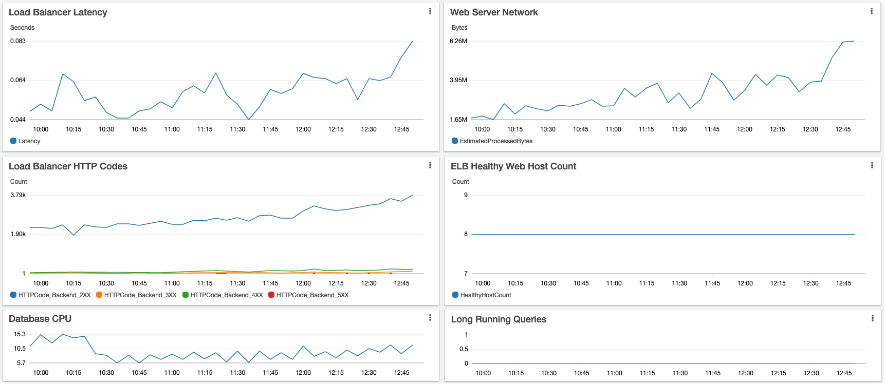
Web users of the SaaS product
This should be pretty easy: How do we tell the health of and stress on of a pool of webservers and load balancers? Some ideas: Total inbound traffic, Latency, counts of various HTTP response codes (Seeing a bunch of 500’s all of a sudden is problematic), number of currently healthy hosts, etc.
Data Persistence (e.g. SQL, ACID database)
SQL databases are notorious pain points as they do not tend to scale horizontally very well. The “D” in ACID stands for “Durability” (once a transaction has been committed, it will remain so, even in the event of power loss, crashes, or errors)… With that guarantee of durability typically comes the cost of a disk write, which carries the potential of locking, blocking, or just plain-old “crawling”. So let’s keep an eye on the persistence layer. Again, not too difficult - most databases have ample tools for peering into their health and behavior. DB CPU is one we like to watch. Some people like to keep an eye on blocking or “counts of locks”, we also like to keep an eye on long-running-queries. We use a custom metric with an adjustable threshold for monitoring long running queries – our definition of a “long query” will be different from yours.
OK! Now let’s see where we stand on our new dashboard. We’ve chosen, for the web tier, Latency, overall network throughput, HTTP codes at the load balancer, and total number of healthy hosts. For the database layer we will watch DB CPU and Long running queries:
Now We are getting somewhere but we have a long way to go. Let’s keep going and look at the next two points in our ordered list of pain:
Communications with IOT devices
If you have IOT devices in your infrastructure, you probably have a few unique challenges:
- Their limited processing capabilities may mean that they aren’t communicating through typical channels (e.g. RESTful API calls)
- The limited power capabilities (Have you tried to talk to a solar-powered IOT device in the winter?) may mean you cannot always communicate with the devices
- Mesh, cellular, or municipal WIFI may mean large numbers of devices go offline and come back online in bursts
So how do we monitor this IOT layer? Our IOT devices are communicating via an RPC (Remote Procedure Call) mechanism. We have thousands of devices (including solar-powered devices) and these devices are on and offline throughout the day. So we have generated custom metrics (more on that topic in another blog post) that allow us to see the RPC failures, retries, and initial sends. Unique to our IOT architecture (due to the constraints listed above) is that a very high RPC failure rate is quite normal.
Asynchronous processing & Periodic cleanup
Next in our pain layers is async processing (here your behaviors are possibly quite different). This layer also auto-scales up and down with volume (presumably the same as your web tier) but probably much more often than your web layer. Should auto-scaling fail, we will rapidly see a large backlog of jobs. We will also want to monitor this layer for traffic and CPU utilization.
Very useful here is superimposing two metrics that may use completely different scales. For instance: “Worker Queue Size & Hosts”. It may be that the number of workers we are running normally fluctuates between 4 and 24. The number of jobs those workers might have in their queue backlog may normally be in the range of 100 to 3,000. This queue backlog could fluctuate to tens of thousands during a peak time (or when a large group of IOT devices suddenly comes online). So you will want your graph, ideally, to handle a different Y-axis scale for each of these metrics.
In our example, the “Periodic Cleanup” is also handled by this worker layer so we are getting a two-for-one here.
Let’s see what this chunk of our dashboard looks like:
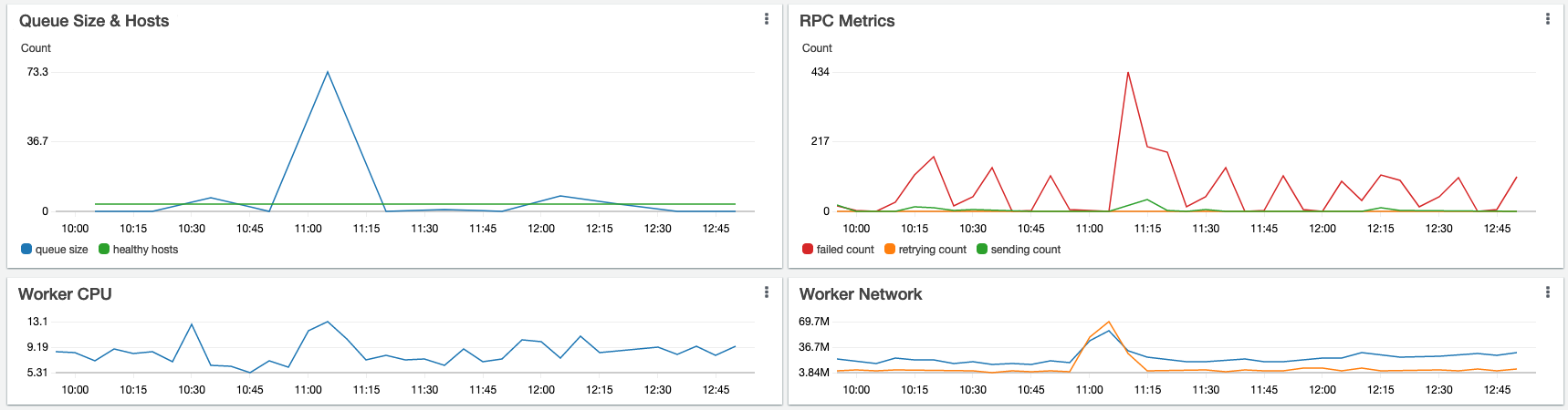
Looking good! Combining these two sets of graphs on the same dashboard gives us a single-screen summary that lets us quickly look at the health of the Top four most important layers of our architecture! This is fantastic, but we should keep going down the layers of pain until we’ve “come to the end”:
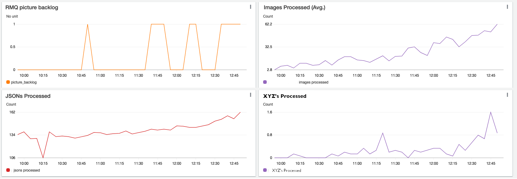
Inbound “raw” data in a constant stream (e.g. images, telemetry, …)
Again you may or may not have this particular scenario. If you do process large amounts of raw data, you probably are familiar with the following challenges:
- Extreme fluctuations in volume from minute-to-minute and hour-to-hour
- Some type of AMQP or message-broker is involved to isolate your system from these fluctuations
- Your business model tolerates these fluctuations “up to a point”, then you start hearing about it if processing latency rises too high
So, let’s assume we have inbound images (along with separate metadata) from the IOT devices: The images flow through the AMQP server (which guarantees delivery at least once), and we have a microservice that consumes from the AMQP server and handles image resizing and database persistence. Pretty straightforward stuff, but important to monitor. Some areas where we need quick visibility: What is the backlog of images? What is the backlog of metadata? How many images are we processing in some time period (throughput), what is the health of the AMQP layer?
A challenge here: The microservice consumer of your AMQP server is almost certainly auto-scaled. So any locally-stored “counts of work” handled by a consumer instance will be reset as the instance is terminated. You can deal with this by storing the metric somewhere in your caching layer (i.e. increment a counter in your memory cache) or, better yet, create and maintain a custom metric. I will create a separate blog post to discuss some nuances of custom dashboard metrics.
So let’s cherry pick a few of the measurements of raw data streams and add a few more graphs to our dashboard:
Continue the process
At this point you should have enough of a feel for how to create the full dashboard in your environment: Keep going down the layers of pain and repeat the exercise:
- Think about what is most important to quickly show the health of this layer
- Consider problems and failures your team has had in the past at this layer
- Create custom metrics as necessary
Summary
You and your team are now well on your way to an extraordinary and useful “Environment health” dashboard! Do not be afraid to create and set custom metrics for your situation! Very often the only true way to measure the health of your particular environment is to use the knowledge your team has about your codebase to create unique meaningful metrics. You can write the new metric directly from your code, or create a Lambda (or an Azure function) that interrogates your system and then writes the metric on a periodic basis.
I hope you enjoy the feeling of inner calm that comes having a well-designed and functioning dashboard letting you quickly view the vital components of your architecture.